The Rapid7
Design System
Building the foundation


In 2018, I joined the UX Visual Design Team at Rapid7—a prominent cybersecurity company.
At the time, Rapid7 had a growing suite of products, an expanding UX team, and the beginnings of a basic Style Guide hosted in Sketch. Yet, standardization across the many product teams still proved challenging.
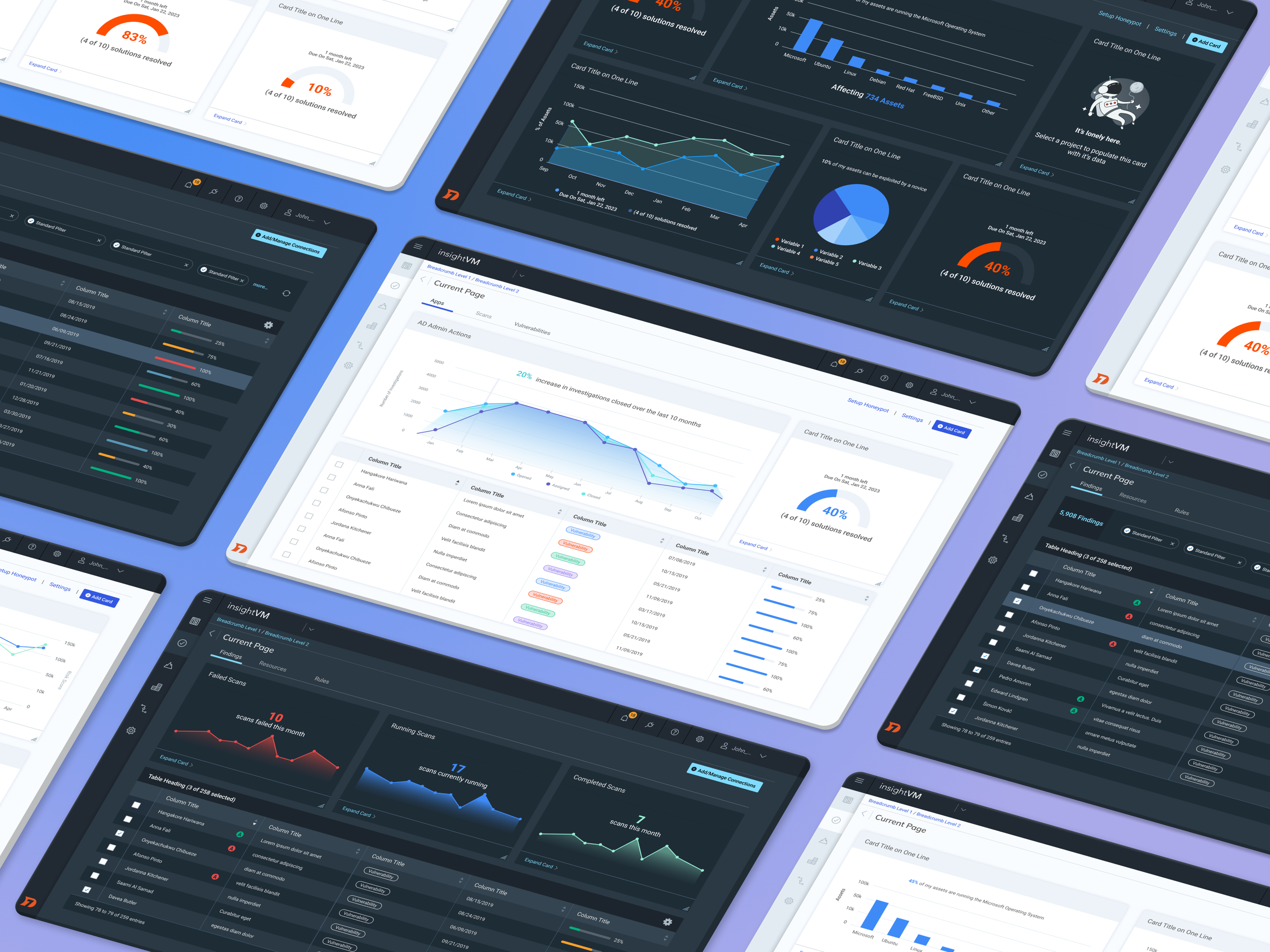
During my time on the UX Visual Design team, we made instrumental steps forward in evolving our style guide into a robust Design System, which allowed both the engineering and design teams to stay aligned and in sync with evolving Product design driven by the UX organization.
CURRENT STATE
The initial condition of the Rapid7 Style Guide, while promising, illuminated substantial challenges that impeded design efficiency.

No Naming Convention
No Symbol Library
No Shared Styles

Cross-Team Inconsistency
Failed WCAG
Our team knew that a unified design system would address these challenges by providing a single source of truth, standardizing components, and increasing designer efficiency. Our team embarked on a mission.
NAMING CONVENTION
The first challenge was to introduce a coherent naming convention for the Style Guide.
I worked alongside two other designers to establish a hierarchy in which we could organize all components.
Once we had buy-in from the wider UX team, we began converting all components to fit into this new naming convention.
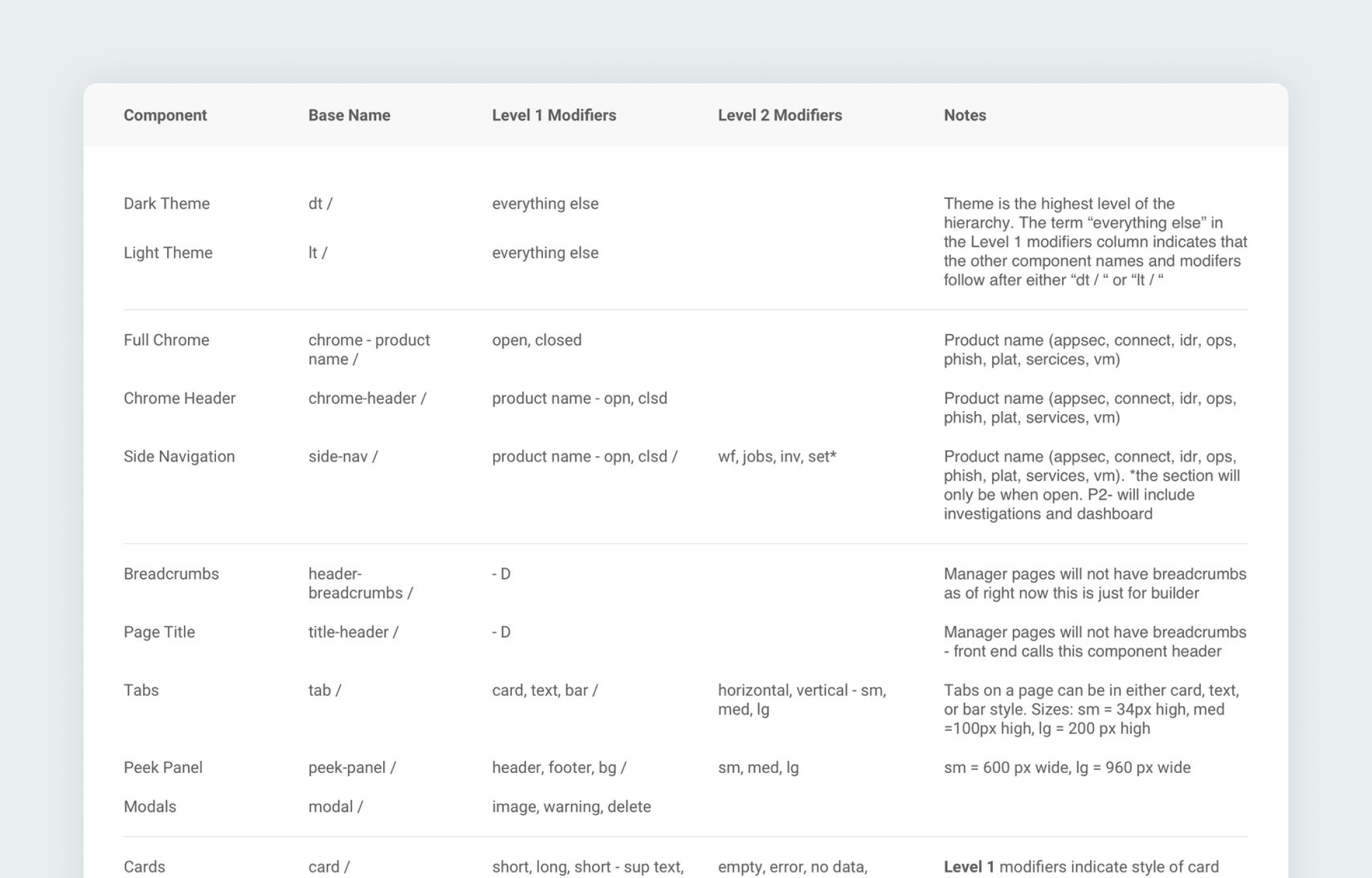
COMPONENT CATEGORIZATION
Since our file was hosted in Sketch at the time, this new naming convention allowed categorization within Sketch’s Libraries feature, making it easier to find and use the right elements.
This allowed our designers to quickly prototype, and focus on solving design problems instead of wasting time searching for the right variant of a component — or worse, creating new versions.

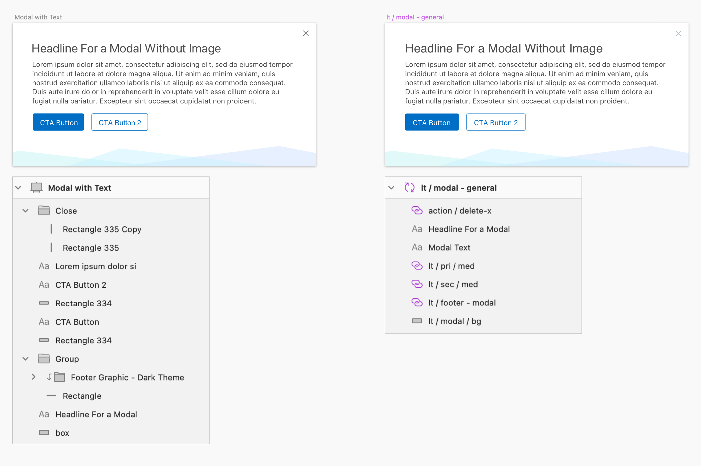
COMPONENT LAYERS
Simultaneously, we reorganized component layers.
In this comparison, you can see the layer items on the right are listed from top to bottom in a logical order.
Instead of randomized layers with confusing names like “Rectangle 335 Copy”, the layers now started with the headline, copy, primary button, secondary button and so on… making it a far less frustrating experience for a designer to work with quickly.

SYMBOL LIBRARY
Another glaring efficiency issue for designers was the lack of a symbol library. This meant that every occurrence of a specific component within the style guide or working files existed as a distinct and severed instance, unable to receive updates from our team.
Once we reorganized the layers, naming conventions, and categories, we converted components into symbols. Now, once a designer inserted a symbol into their files — like a button or dropdown, any updates to the global style guide would push to their working files as well.
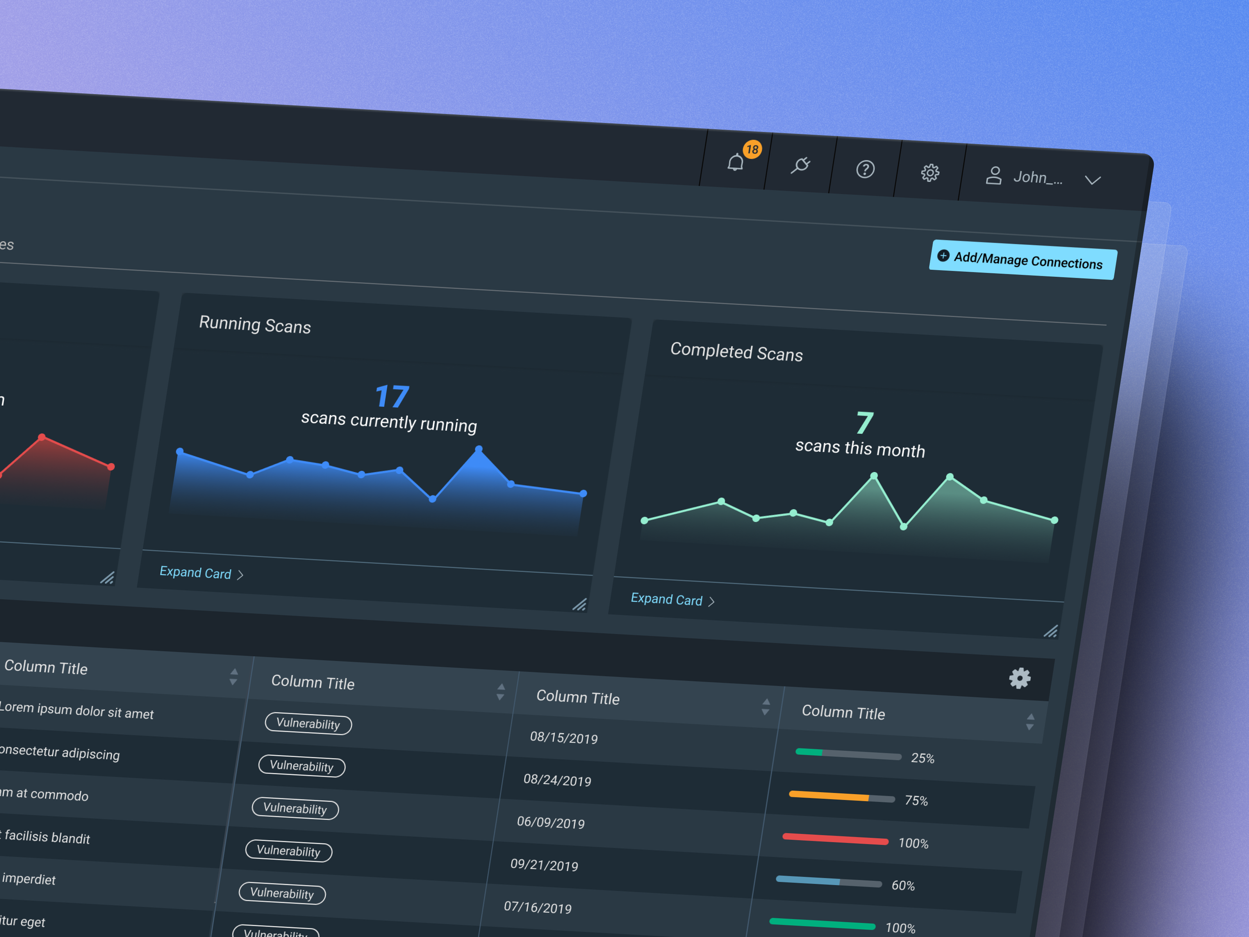
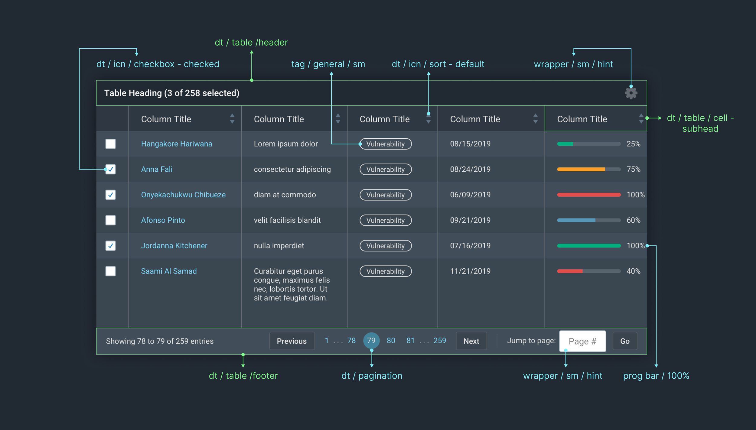
PURPOSEFUL COMPONENT REBUILDING
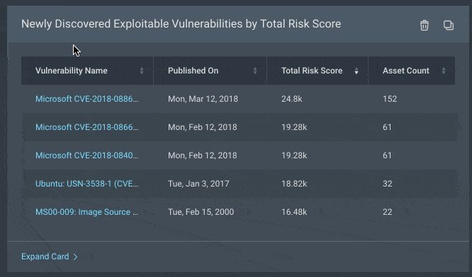
Many more complex components, like this table for example, needed to be re-assembled from scratch using the smaller symbols it is made up of.
Additionally, our team needed to put extra care and though into how we re-assembled these components, so that designers could easily delete, add, or modify particular pieces.
For this table, designers needed to be able to change cell types, add buttons relevant to their use case, add or delete rows and columns, and modify the header and footers easily.
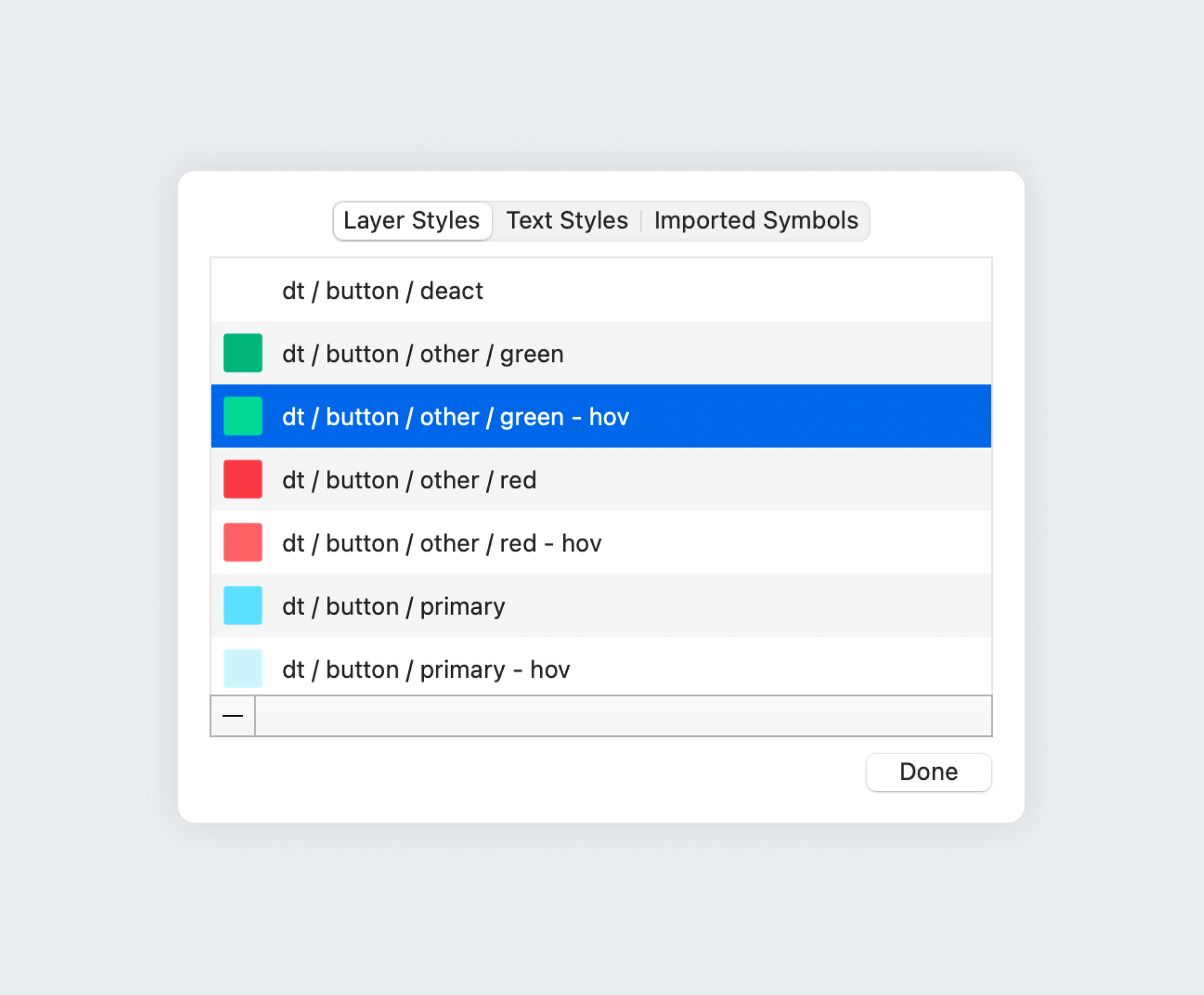
COLOR STYLES
To further our mission for consistency, we established shared color styles and updated each component's hex codes to align with these styles.
Previously, while components might have used similar colors, they existed as isolated entities. Consequently, when a color update was necessary, each component had to be manually adjusted to reflect the change—a process that demanded time and attention.
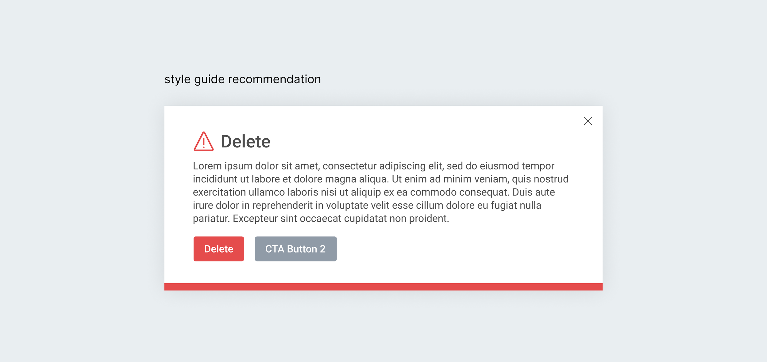
USAGE GUIDELINES
With a growing Design System, a growing UX team, and growing product teams, it was sometimes left up to individual interpretation how these elements should be used, especially in combination with each other.
It became clear that it was essential to begin offering more guidance around usage and patterns for our components.

By the end of this process, we had converted the Style Guide into one that was fully comprised of reusable symbols.
Each element was categorized, named clearly, linked to global color styles, responsive, and constructed logically.

BENEFITS
These efforts benefitted our teams in several ways
Any updates made to global components would push out to all Designer’s files
Much more efficient to find the right components for rapid prototyping
Complex components ( such as tables ) are easier and faster to resize, modify and use
Icons, colors, text, and other styles compatible with individual components was as easy to change as a simple dropdown
No more guessing!

PARTNERING WITH DEV
But our work didn’t stop there, A Design System comprises not only UI kit components but also entails a symbiotic relationship between design and development.
Our team partnered with UX engineering on the translation of designed components into front-end code. Our collaboration with the UX engineering team was close and purposeful, aiming to establish a unified user experience.
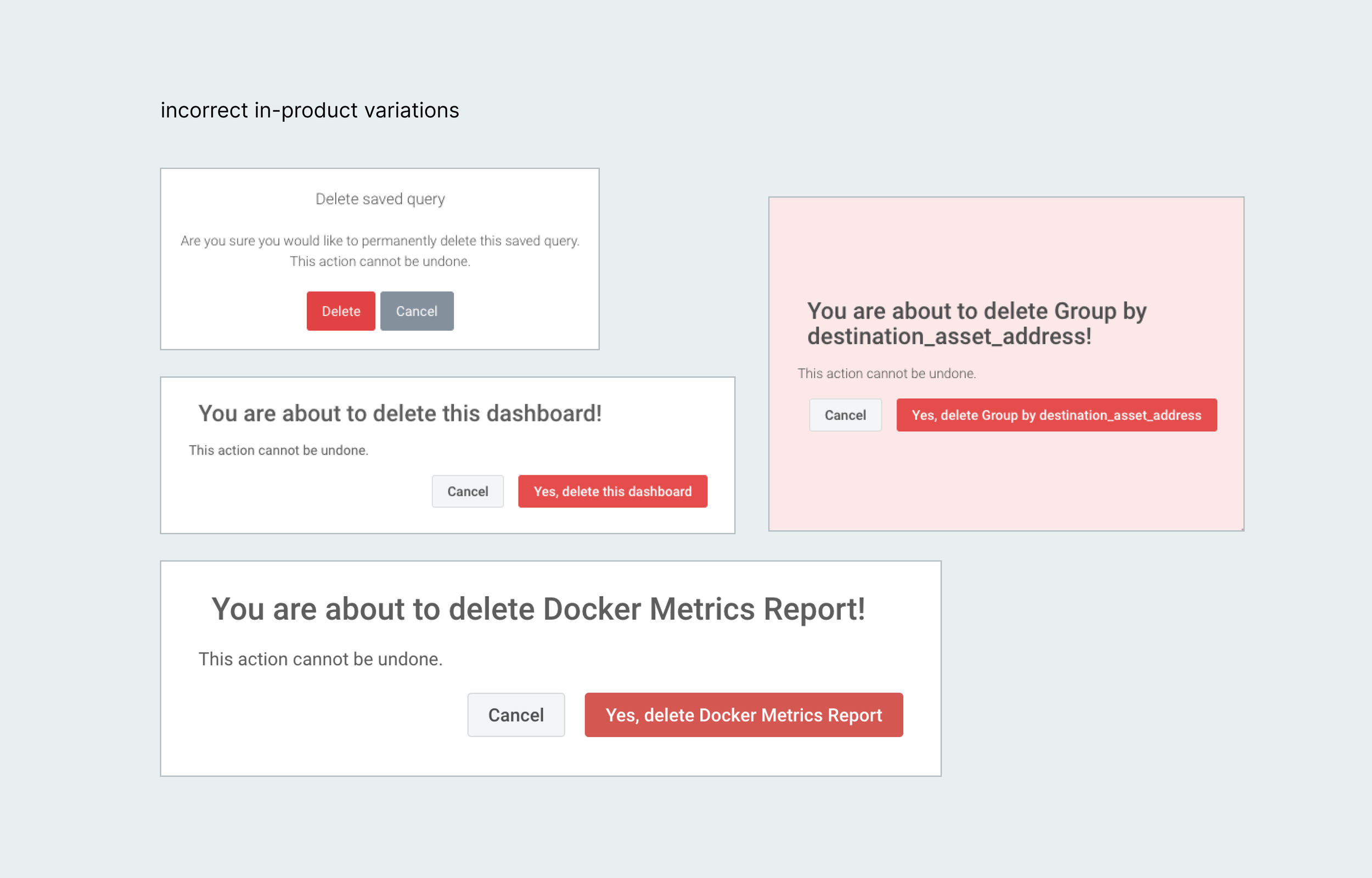
PRODUCT AUDITS
Our UX Visual team and the UX Engineering team would often serve as advocates on behalf of the budding Design System. Many product teams were still in a transitionary phase, slowly converting over to the UX Engineering’s provided code for all of the existing elements.
Product audits were a tool we used on the UX Visual team to uncover inconsistencies between the products styles, patterns, and components against our current style guide.
We would then work with the engineering team of that product to create a backlog of tasks to update old or incorrect components/pages.
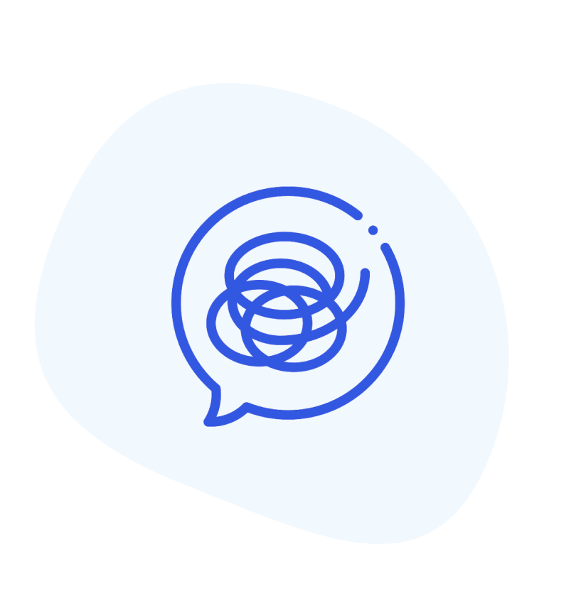
ICON LIBRARY
Rapid7 had a library of roughly 500 icons used within our suite of products as well as our customer-facing website and materials.
While on the UX Visual team, I was often responsible for illustrating icons for new use cases and evolving design needs.

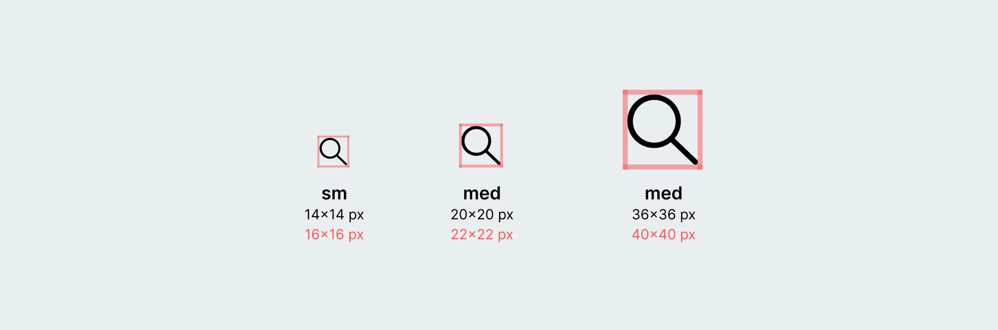
Icons were recommended to be used alongside text for context clarification, before or after a word. An icon was recommended to only be used by itself if its context was self explanatory.

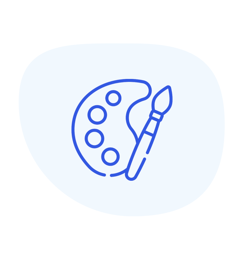
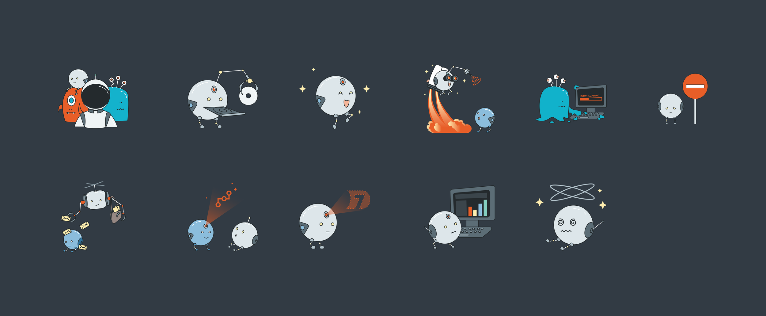
INTRODUCING ILLUSTRATIONS
When I was first hired by Rapid7, our product’s visuals were relatively simple.
With the highly technical content that our users interacted with daily, we saw an opportunity to add a bit of levity and delight into the User Experience.
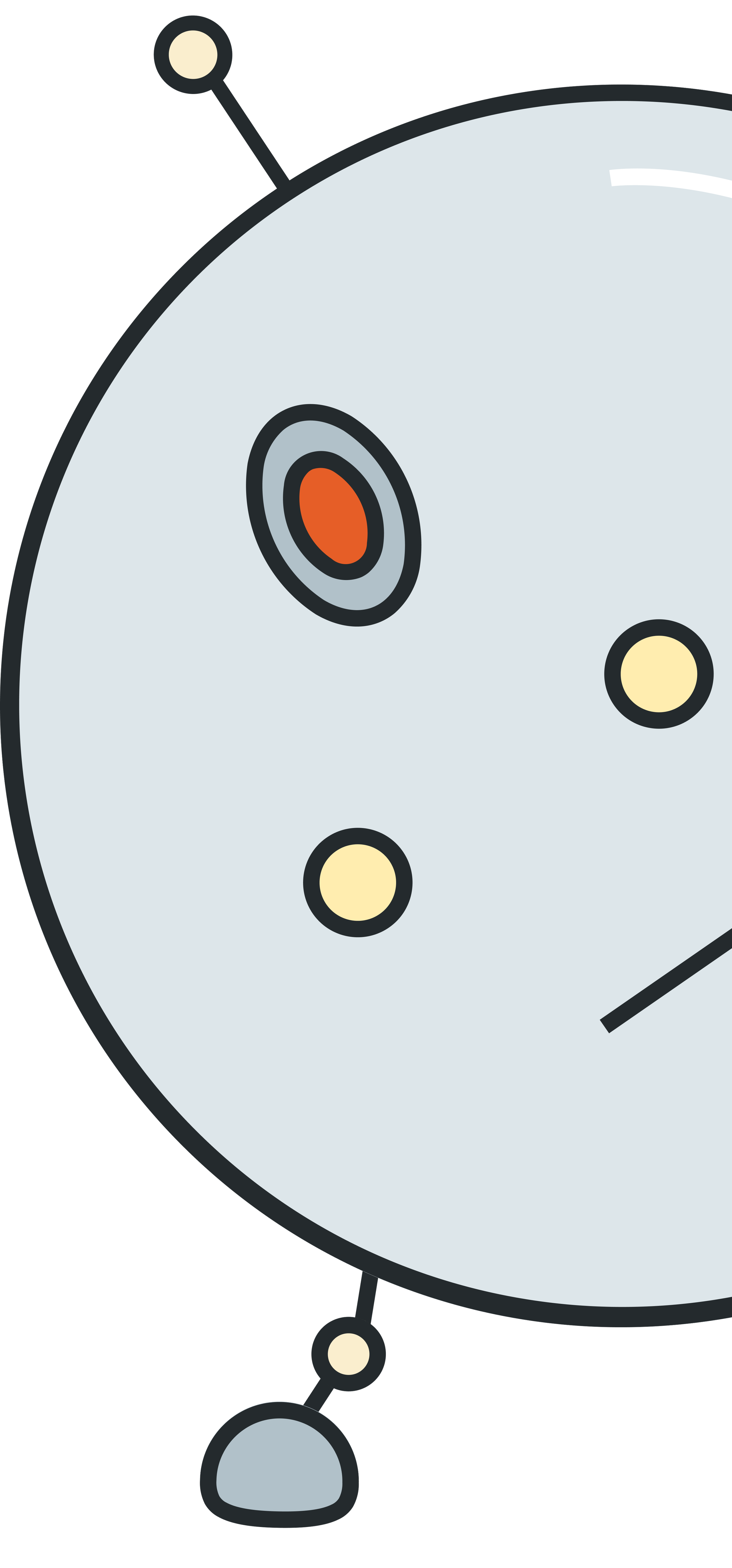
Thus, Rapid7’s robot characters were introduced, and provided the user with playful, visual feedback on anything from the 404 Pages, to Success modals, and beyond.
I created a small cast of characters to be used throughout the product suite for some visual variety. The characters use Rapid7 brand colors and are used sparingly and purposefully.


Each illustration has a particular use case associated which I documented in the Usage Guidelines to help UX designers choose appropriate graphics for their projects.
Designers also occasionally requested a new graphic to be illustrated if one was appropriate and I did not have one already created for their use case. It was then created and added to the styles library.

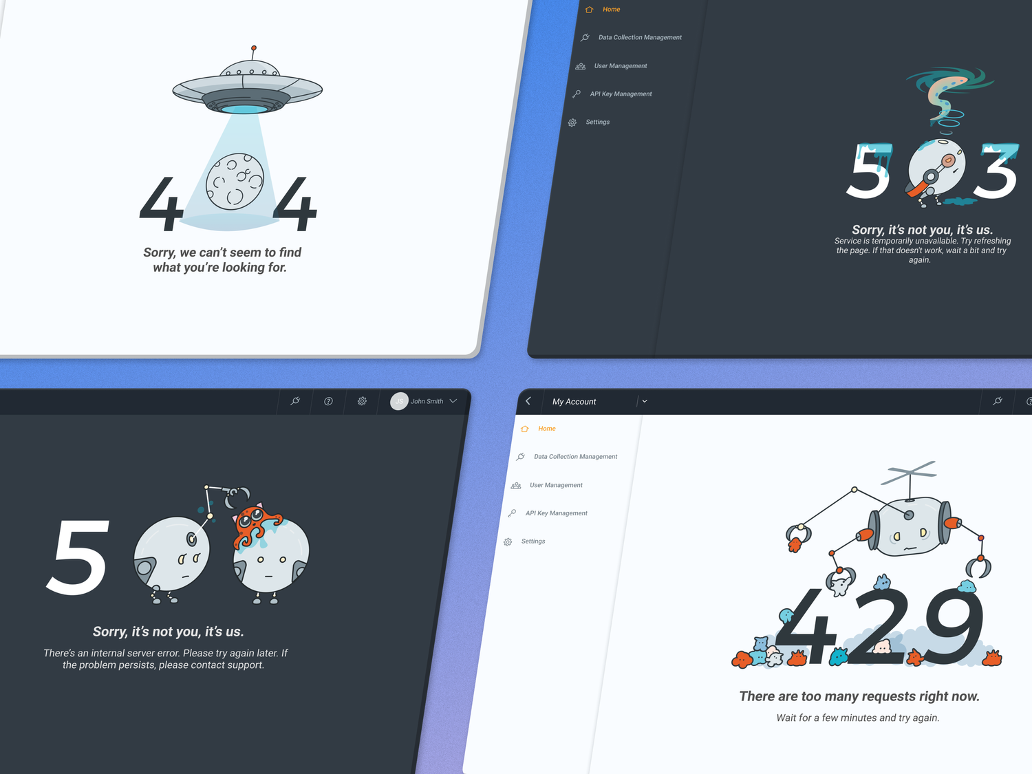
We also had unique and whimsical character illustrations for each of the error page variations. 404, 401 429, 500, 505, and 503.

Each illustration works with both the dark and light theme of Rapid7’s product UI.
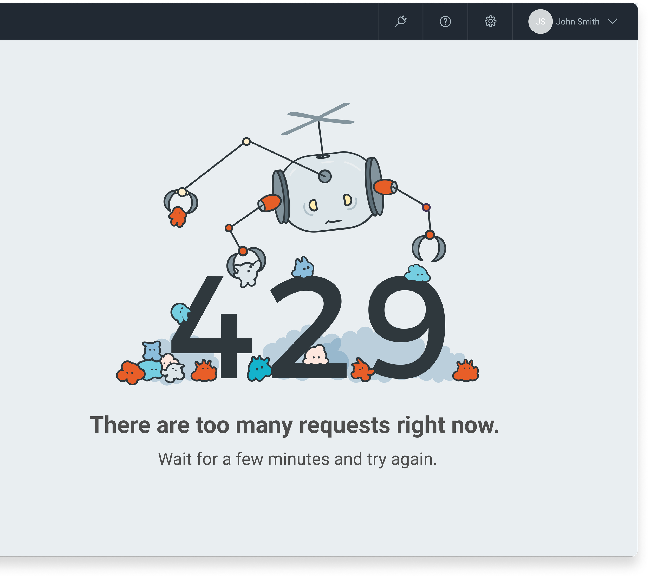
For the error state illustrations, I added some subtle animation to add a bit of fun.
CONSTANT EVOLUTION
Finally, our component library was in a constant state of evolution. We regularly received feedback from users which prompted us to rethink certain components, patterns, and styles.
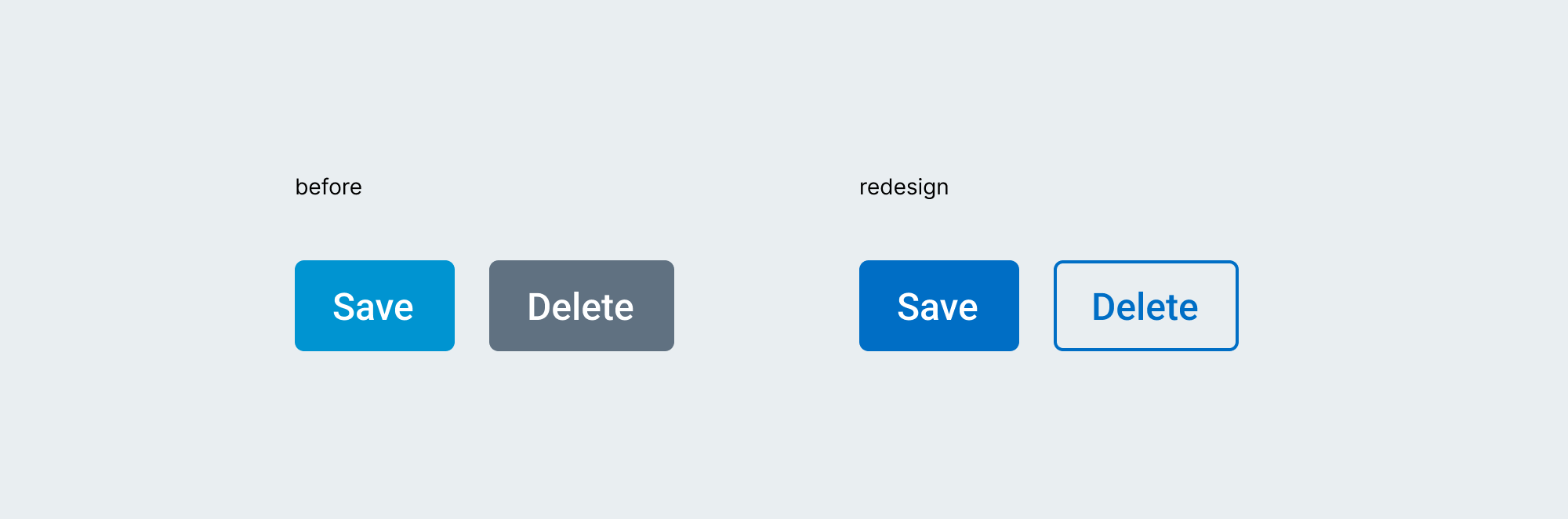
For example, in the example above, our users reported feeling unsure about which button was the primary action. We redesigned the secondary button to take up less visual emphasis on the page, allowing for better contrast between the primary and secondary actions.

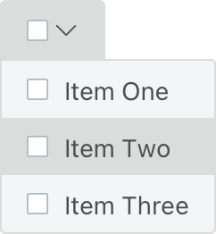
In the above example, users reported not being able to decipher which item in our Toggle component was the selected item. We redesigned it to use our primary color as the selected piece, which increased the contrast quite a bit from the original, this change made it easier to understand.
THANK YOU
